One’s ability to navigate and understand place is dependent upon maps, language, past experiences and contextual clues. Over time, experiences give us a basis of knowledge for understanding a hierarchy of information. Instinctually we apply this in new situations and draw analogies. However, there are times when this isn’t enough because things change. Experience is based upon history, and we are in the present.
Now, more than ever, our past experiences and expectations for what we find at a library do not fully equip us for the reality. The composition of the collection has shifted to include more digital resources, technology is found throughout, and there is almost equal emphasis on content creation and consumption. The library is considered a hub for its community, and is multifaceted in its use. Combine this with the shifting demographics of our country, and it becomes more important than ever for libraries to fine-tune their signage and wayfinding strategies.
Drivers of Usage
The Pew Research report, Internet & American Life Library Survey shows the range of library uses among the 53% of Americans who visited a library in the past 12 months:
- 73% of users browse shelves for books and media
- 73% borrow print books
- 50% get help from a librarian
- 46% use a research database
- 23% attend a meeting
- 21% attend a class or program
The Rhythm and Movement Through Space
One of the most important and insightful practices, prior to developing a signage strategy, is to conduct user observations. These exercises can be challenging, but worthwhile. A librarian’s perspective as someone who is in the space daily and privy to its inner workings is different from a visitor’s. Nonetheless, fresh insights can be gained whether observing users who visit daily or individuals who visit 4 times a year. When viewing a space through a new lens and observing users, keep the following 2 principles in mind.
First impressions foreshadow user experiences.
Wayshowing is the idea of welcoming, orienting and guiding patrons throughout a space. When visitors enter the library is the space open, allowing for transition and assimilation, or do visitors need to quickly determine where to turn next?
-
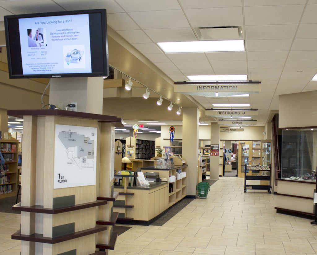
- Floor directories or maps placed inside main entrances help visitors quickly find their way. The Cedar Falls Public Library (IA) creates a communications hub along a main pathway. They use digital signage to alert visitors to upcoming programs, place floor maps near the information desk and call attention to key areas with overhead signs.

Visibility, clarity and simplicity are primary considerations in signage decision-making. The American with Disabilities Act (ADA) guidelines recommend that letter height be 4″ to be visible from 100 feet away. Typical overhead signage guidelines are at least 3″ high characters and numbers when suspended 80″ overhead.
Forging Confidently Ahead or Awkwardly Searching?
Wayfinding reinforces to visitors that they are on the right path. Until their destination is reached, users are continually searching, making decisions and moving in a direction, repeating this process as often as necessary. Wayfinding can lure browsers to new places and serve as a navigation tool, guiding those with a specific need or destination.
As you survey the interior horizon, are there ceilings, columns or visible corners you can leverage? It is important to note places where users must make choices on which path to take. These are all potential locations for signage or graphics.
-

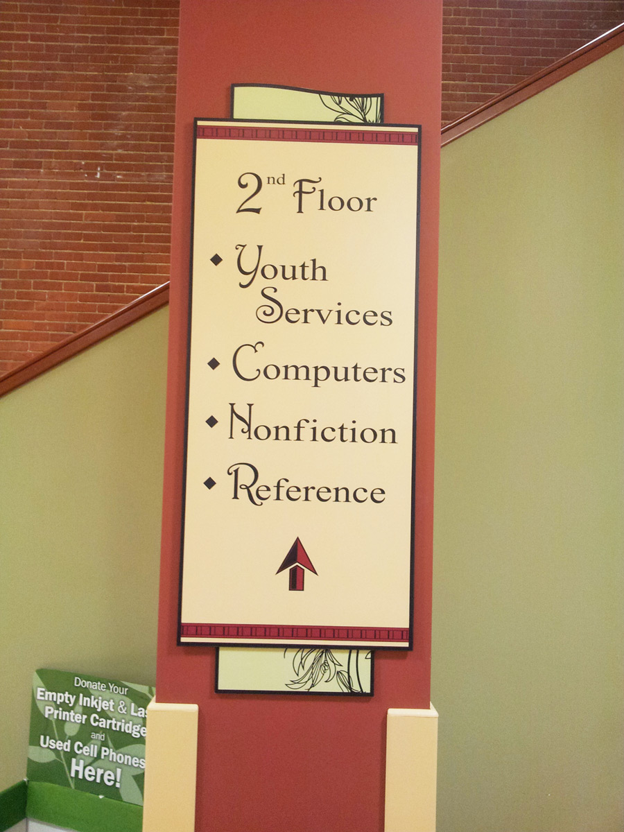
- A column near the stairs informs visitors what is on the second floor of the Bosler Memorial Library in Carlisle, PA.
-

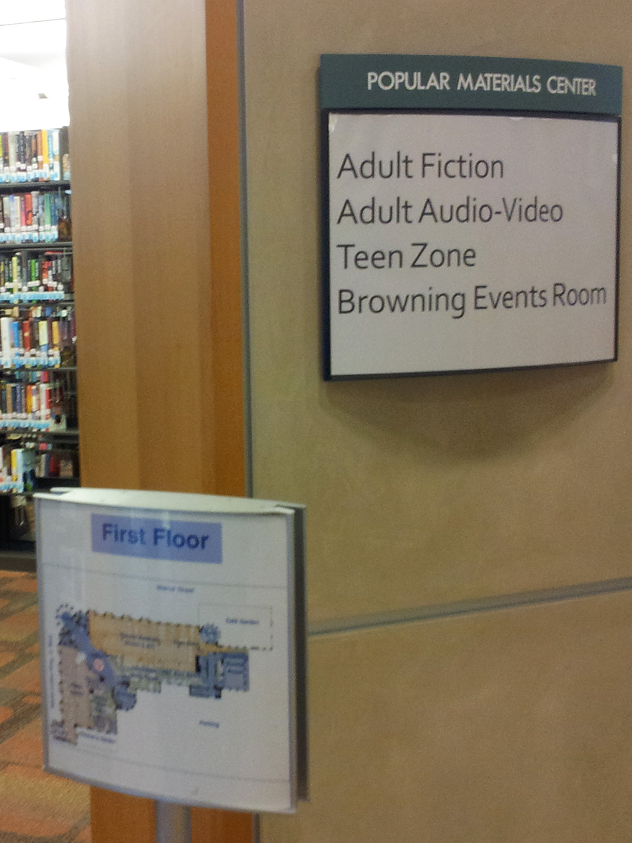
- Popular Materials Center graces the entrance. A secondary sign details what you will find in this area and the floor map guides you to your destination.
Keeping it Simple
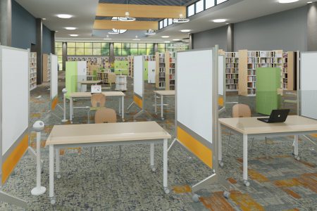
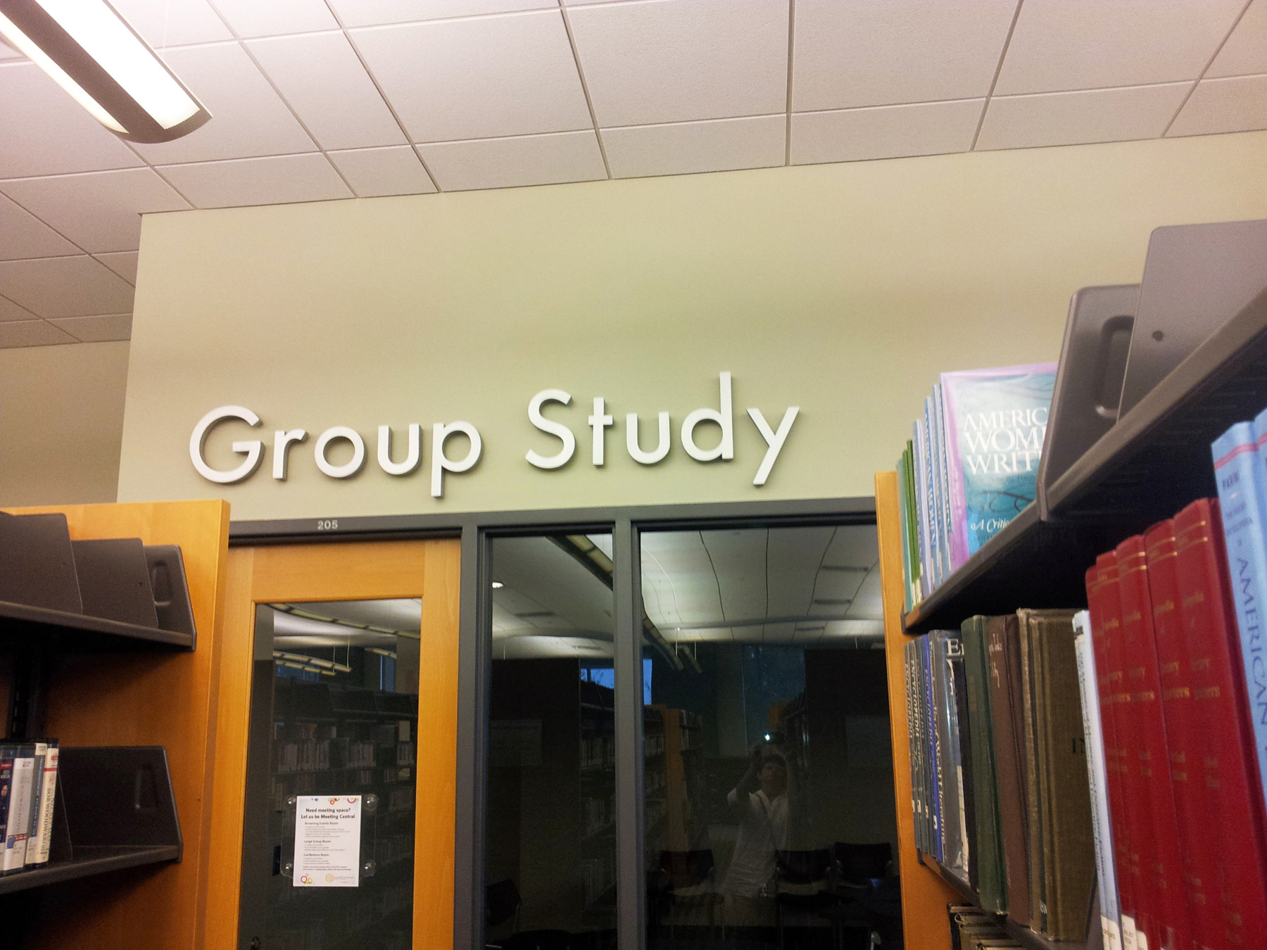
Patron use, along with new services, is changing the organization and presentation of library spaces. Libraries are busier than ever and they need to facilitate as much self-sufficiency as the user desires. A shift in organizing and labeling from Dewey Decimal to genres, separating out popular collections, creating digital media labs, offering group study rooms and collaborative spaces are all accomplished by sifting through layers of complexity and accounting for numerous details and decisions.
As you evaluate the range of options available, remember that a cohesive and consistent presentation of design, font, colors and placement assist visitors and can serve as triggers for where to seek out information and what information they will find. Clear, jargon-free word choices will help ensure users understand your intent.
Location is visible from a distance and identity is directly above entries at Evansville Vanderburgh Public Library (IN)
A Point of Reference in a Larger Context
Through your observations, you should have gathered a broad range of insights that address the hierarchy of information needs. The goal of your signage plan is to have just enough signage to strike the right balance of guiding, directing, informing and instructing library visitors in a manner that enhances their experience.
Guiding underlies wayshowing, helping people travel through a space to their ultimate destination.
-
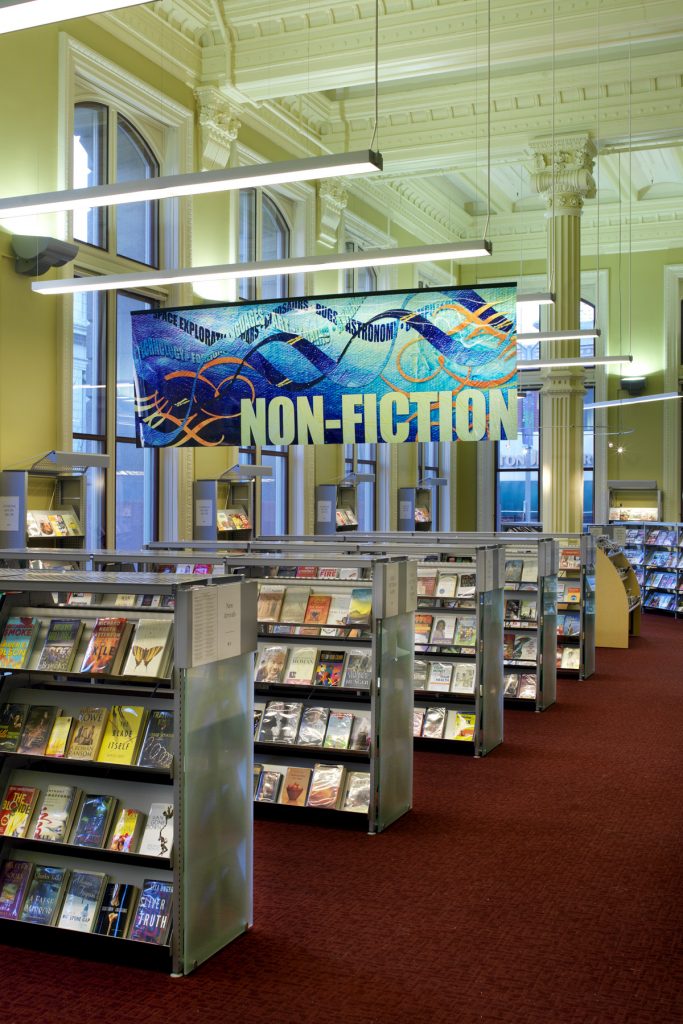
- Overhead banners are highly visible and draw you into the collection at St. Louis Public Library (MO).

-
- Columns are beacons easily becoming a way finding asset. Joshua Hyde Public Library (MA) applied highly contrasting colors, appealing to young visitors.

-
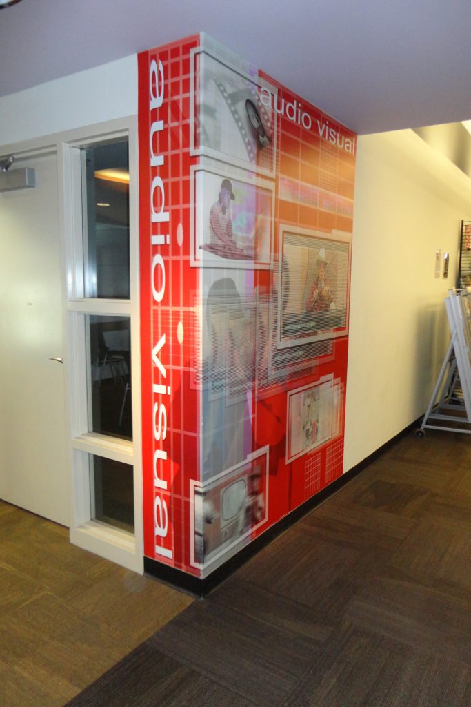
- Large format graphics at Cleveland Heights Public Library (OH) wrap the corner, ensuring visibility from all angles.

Directing visitors to their destination is achieved through effective wayfinding.
-

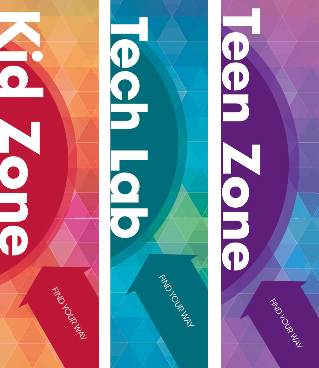
- Consistent placement of the green arrow near the text triggers visitors to go in a certain direction. These are examples of directional signage.
-

- Consistent placement of the green arrow near the text triggers visitors to go in a certain direction. These are examples of directional signage.
-

- An engaging graphic can be consistently used, with a change in color & text to signal different areas in the library.
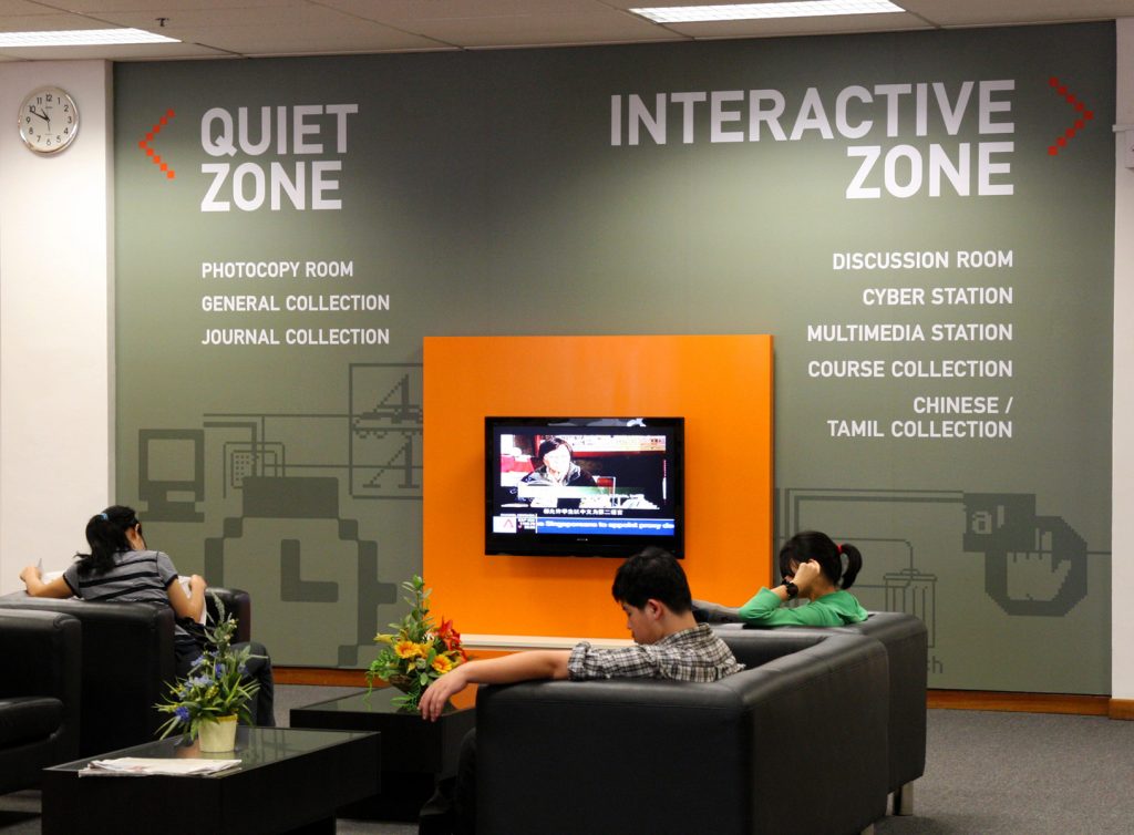
Inform patrons of services, programs and collection details.
-
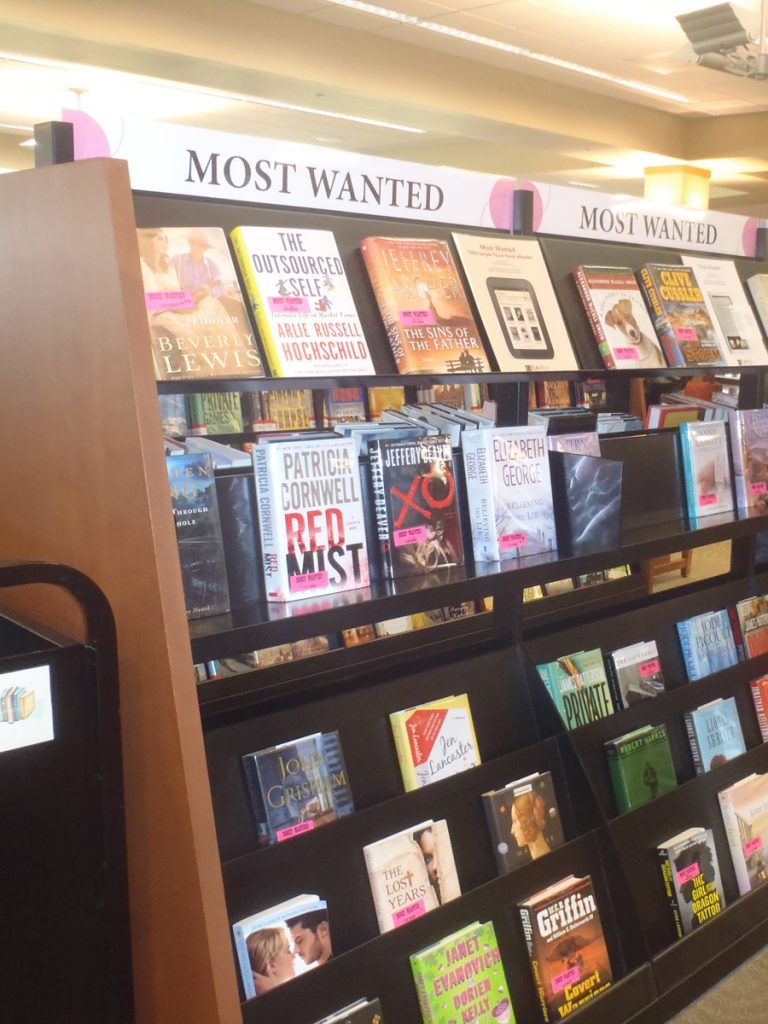
- Face-out displays, signage and custom labels reinforce a popular part of this library’s collection.

-
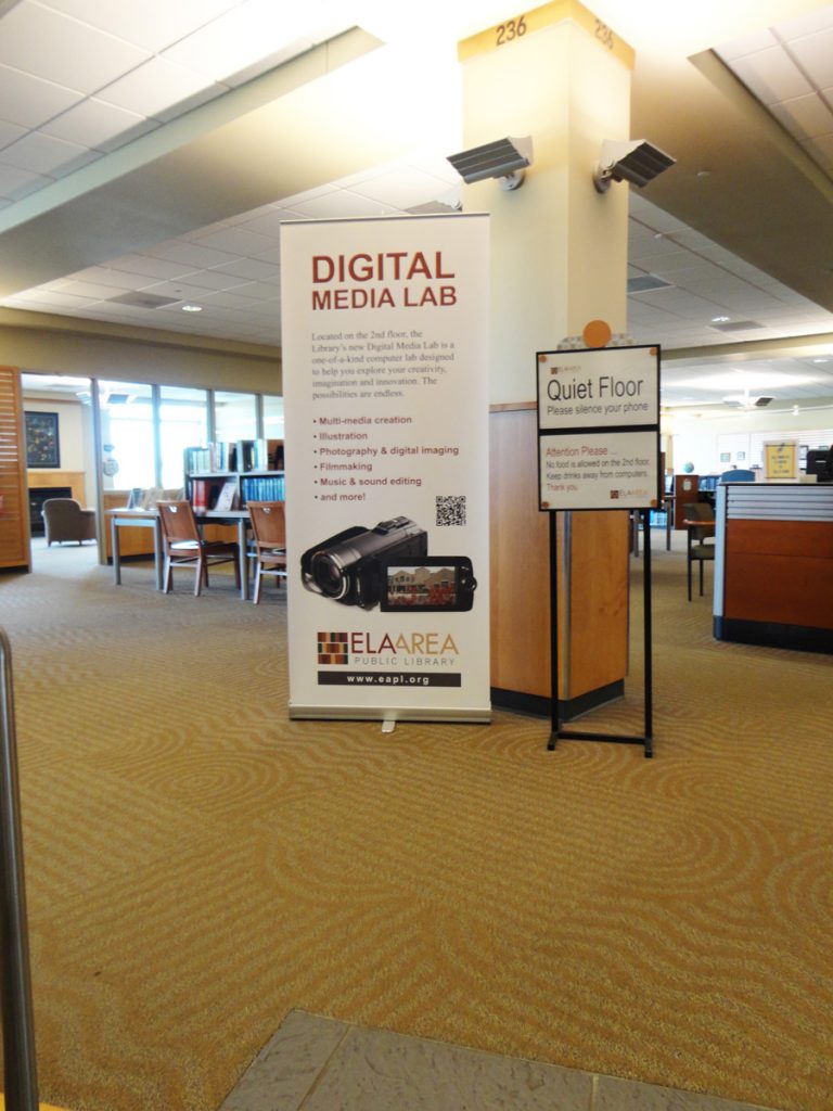
- A pop-up banner near the main entrance calls attention to a new space and suite of tools.

-

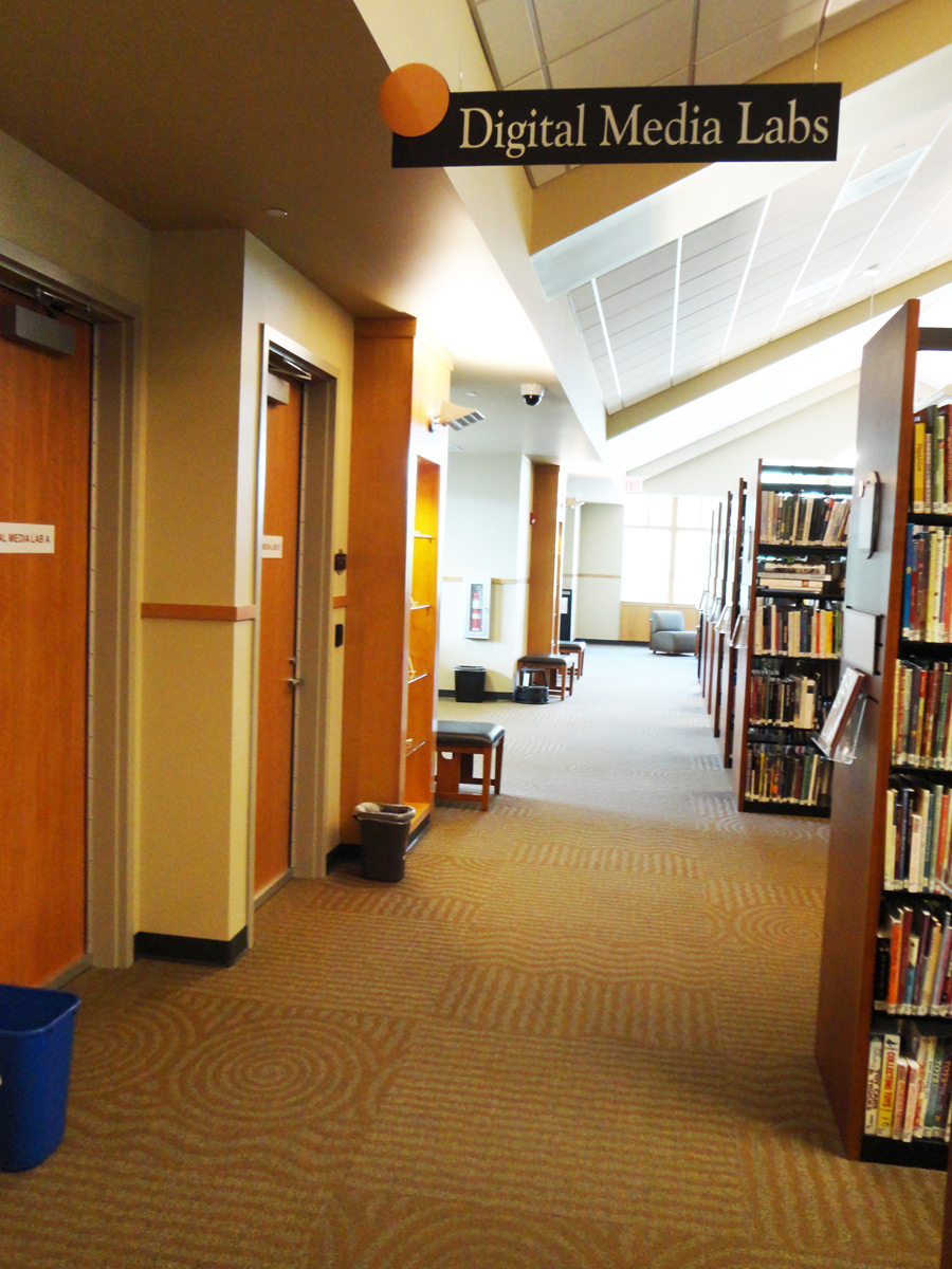
- The overhead sign in a main traffic corridor directs you to the entrance on the second floor.
Instructing gives people information about what to do or where to go.
-
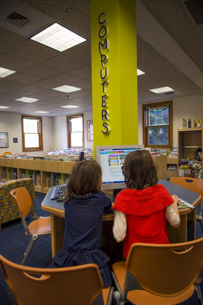
- Look no further than the furnishings to know what happens here.
-

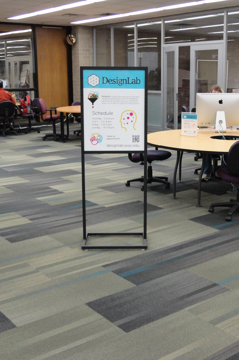
- A temporary sign at the Helen C. White library on the University of Wisconsin—Madison campus informs and instructs students on how to access the space and services.
-
- Huge directional signage with supporting information near a lounge area. Photo taken by David NG Soon Thong from Singapore.

Draw Patrons In & Back Again
Research finds that only 22% of library users are aware of all or most of the services and programs their public library offers, while 46% know of some of what their library offers. It is much easier to engage people who are already users than to bring in new ones, but trying to cover all this ground could lead to “signage overload.” Graphics, colors and furnishings can be used to indicate space and act as visual clues before reading a sign. A guiding principle of signage is less is more. Strive for simplicity and effectiveness.
For Additional Information or Assistance
Demco and our team of library experts are available to help you, whether you need to supplement your existing signage or develop a comprehensive plan. To get started on your signage plan, call 800.747.7561.
Additional Resources:
- Arts & Science of Sign Design
- Wayfinding and Signage in Library Design 2003
- Wayfinding the San Jose Way – September 2014 webinar presented by Ruth Barefoot of the San Jose Public Library
- Mollerup, Per. 2013. Wayshowing>Wayfinding: Basic & Interactive. BIS Publishers.
Angie Schoeneck
Latest posts by Angie Schoeneck (see all)
- Wayfinding & Wayshowing - October 22, 2014